
In my online course, Apps for Librarians and Educators, one of the assignments is to read some of Apple’s iOS Human Interface Guidelines.
These guidelines are for app developers, but it’s also very useful and eye-opening for app users to become familiar with them — especially if you are an information professional or educator who helps others with mobile apps and writes reviews of them.
These are the sections I ask my students to read:
UI Design Basics
- Starting and stopping
- Interactivity and feedback
- Branding
- Color and typography
- Terminology and wording
Design Strategies
iOS Technologies
Icon and Image Design
Thoughts after reading the guidelines
Here are some quotes from students in my class — their thoughts after reading these guidelines:
“I was fascinated with these guidelines! I wondered why I appreciated certain apps so much more than others and now I know. I like being able to start with my task/activity as soon as I open an app, I want to focus on the content and not the interaction.”
“First, thank you for including the iOS guidelines in our readings. I would have never sought them out and read them of my own volition. … I was impressed at the thought and care that has gone into these guidelines, and I am grateful they exist. Sometimes the beginning of a tech change is chaotic until some structure and agreement appears. I’m surprised at how thorough and reasoned these guidelines are, and so early in the explosion of app use.”
“These guidelines are something I never would have thought to read, but they show why some apps are so well developed. I know that a lot of work goes into creating an app, but this was more than I expected.”
“Reading these guidelines certainly emphasize that app creation is an art. I really appreciate the minimalism involved in branding. The guidelines seem to place importance on the user’s experience as efficient and streamlined. When product makers respect their users, they gain loyal and usage.”
According to Apple, iOS embodies the following themes:
- Deference. The UI helps people understand and interact with the content, but never competes with it.
- Clarity. Text is legible at every size, icons are precise and lucid, adornments are subtle and appropriate, and a sharpened focus on functionality motivates the design.
- Depth. Visual layers and realistic motion impart vitality and heighten people’s delight and understanding.
Reading or skimming through some of these guidelines will help you understand what makes a well-designed app, and how the best apps delight their users.
Are you writing app reviews?
If you are writing reviews of apps — () — it helps to be familiar with these guidelines as a basis for your evaluation. You can also use my App Review Checklist as a guide.
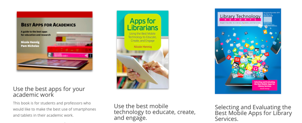
Interested in learning more about how to evaluate the best mobile apps? Get one of my books, especially Apps for Librarians: Using the Best Mobile Technology to Educate, Create, and Engage, and Selecting and Evaluating the Best Mobile Apps for Library Services.