The reason I got an Apple Watch (besides that I enjoy being an “early adopter”) is that I teach courses about mobile apps for librarians and educators. So I’m interested in the future of wearable technologies, how they might be used for education, and how they could make computing more accessible.
The watch taps you.
I’m also very interested in what’s happening with “haptic” technology — Apple’s “force touch” is an example of this and it’s explained on their website:
Force Touch uses tiny electrodes around the flexible Retina display to distinguish between a light tap and a deep press, and trigger instant access to a range of contextually specific controls. <https://www.apple.com/watch/technology/>
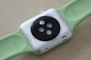
Apple calls this their “Taptic Engine,” (made from the words “tap” and “haptic”). Basically it means that you can press a bit harder to activate certain controls. Also the watch has a feature on the back of the face that taps you, instead of you tapping it. It’s subtle, but noticeable — I like it. It’s much less annoying that a vibrating iPhone sitting on a table. It’s subtle, so that you can be the only person noticing it.
A Learning Curve
It’s true what they say about this device having a bit of a learning curve. Some things are intuitable, and some take some figuring out. Now that I’ve had it for a couple of weeks, I’m comfortable with it. I spent a couple of evenings teaching myself all about it and trying everything — reading up on what I didn’t easily figure out.
Telling Time
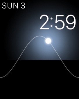
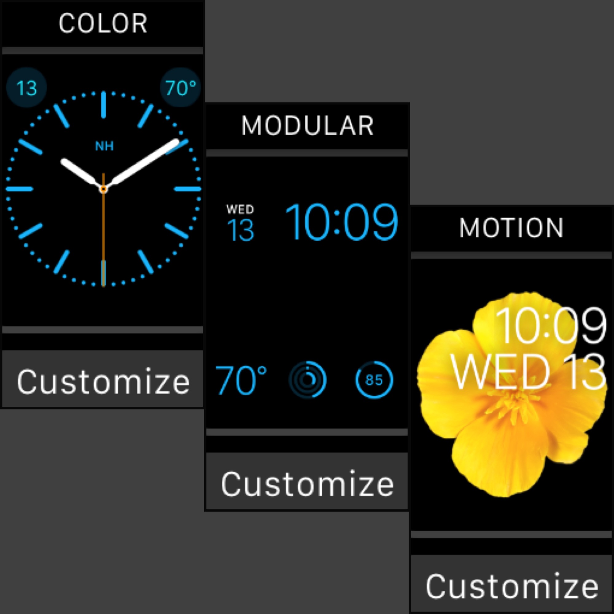
One of the first things I did was try out all the different watch faces and their settings. Each face has different bits of extra information that you can hide or show. I ended up choosing the face called “Solar,” mainly because of its simplicity. I have it set to show only the date and time and it also shows the position of the sun, in a minimalist way that I like.
One nice thing is that you can customize as many of the faces as you like, and easily switch between them. But I’m happy with Solar and I tend to keep it on that.
I’m hoping that eventually Apple will allow third-party designers to create faces — I can see a lot of room for innovation there and I’ll bet many people would pay for extra faces that they like.
See Apple’s site for photos and descriptions of all the faces.
Of course telling time is not the reason I bought this watch — for me it’s to learn about wearable computing and to see where it’s going.
Battery life
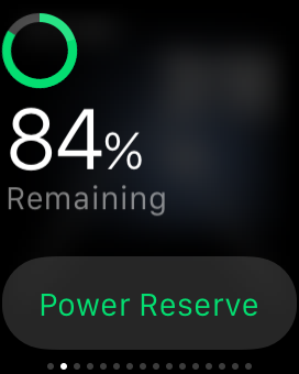
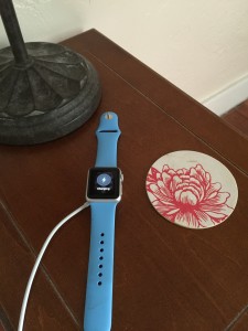
The battery life is great. It lasts all day and I charge it at night. I love the magnetic charging cable — very elegant. Just lay your watch down on it (no precision needed), and it charges (makes a cute “ding” when you first attach it). I leave it on my bedside table and charge every night.
Comfortable strap
I purchased the 38 mm silver aluminum case with the blue sport band. It’s very light and comfortable — more so than I expected. The bands are “fluoroelastomer,” and very, very comfortable. It feels secure on your wrist, like it could never fall off. But it’s not tight and I don’t notice it unless I pay attention to it.
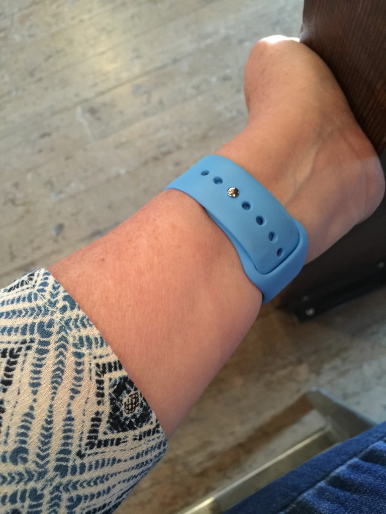
I like the way it attaches.
Glances vs. apps vs. notifications
It took me a while to understand that these are three different things and they work differently. It helped me to finally read Apple’s developer guidelines about these. What I learned:
– Glances
Glances are “read-only,” and meant to display just a bit of info from the app. You glance at it just for a few seconds. Swipe up on the watch face and you see your first glance. Swipe horizontally to see up to 12 glances (for 12 apps). You can decide which ones to turn on. Not all apps have glances. There are built-in glances for battery life, your heart rate, and a few other things, like silencing your watch.
Here’s what Apple tells developers:
A glance is a focused interface that you use to display your app’s most important information. Glances are aptly named because they are intended to be looked at quickly by the user. Glances are nonscrolling; the entire glance interface must fit on a single screen. Glances are read-only and cannot contain buttons, switches, or other interactive controls. Tapping a glance launches your WatchKit app.
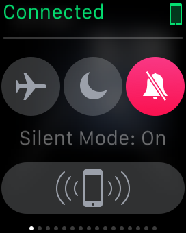
Here’s the glance that lets you quickly turn on airplane mode, “do not disturb,” and silent mode. You can also ping your iPhone, so it makes a sound if you can’t find it (in your house).
– Apps
Apps are watch versions of apps that you have installed on your iPhone. They are usually designed to do just a few things, compared to the full iPhone app. There is a big variation in what each developer has decided to do with their watch apps. Some of the best apps that I like on my iPhone, don’t really please me much on the watch, and others that I rarely use, are just great on the watch — it’s all over the map. Since it’s a brand new product I think developers need time to learn about what works best on the watch. I’m sure we’ll see improvements as people learn what works best.
You can decide which of your iPhone apps to install on your watch during setup, or by using the Apple Watch app on your iPhone. Each app that has a watch version will be listed and you can install or uninstall it on your watch.
Here’s what Apple tells developers about these apps:
A WatchKit app is a user launchable app that appears on the Apple Watch home screen. A WatchKit app is the user’s main way of viewing and interacting with your data. It provides the means to view your data and optionally to manipulate or interact with that data. Depending on the data, a WatchKit app might present only a subset of the data presented by its containing iOS app.
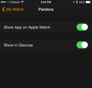
You can decide for each app, whether to install it on the watch and whether to show it in Glances (if it has them).
– Notifications
I remember reading somewhere that there isn’t a watch app for Facebook yet. But then I noticed that I was getting notifications from Facebook on my watch. Why? I learned that the notifications from your iPhone can appear on your watch, too — even if there isn’t a watch app available. You can select whether to have the watch show the same notifications as your iPhone does, or you can change them individually for each app.
Here’s what Apple tells developers about notifications:
Apple Watch works with its paired iPhone to display local and remote notifications. Initially, Apple Watch uses a minimal interface to display incoming notifications. When the user’s movement indicates a desire to see more information, the minimal interface changes to a more detailed interface displaying the contents of the notification. You can customize this detailed interface and add custom graphics or arrange the notification data differently from the default interface provided by the system.
These notifications are some of the most useful aspects of the watch, in my opinion. It’s useful to be able to glance down and quickly see the notifications that you care about.
Since I have over 600 apps on my iPhone (I know, I’m not the typical user), I have carefully turned off most notifications on my phone and set things up to show only those few that I care about. I kept these settings for the watch, since they were decisions I had already made. I like it. It’s great to see when I have a text message and who it’s from — even if my phone is tucked away in my pocket or bag. And it’s nice that you can adjust the intensity of haptic alerts.
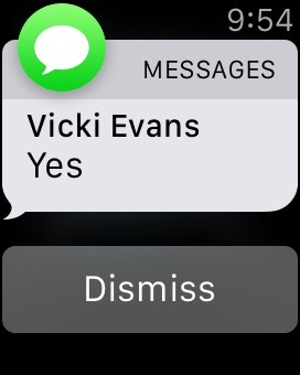
A notification of a text message.
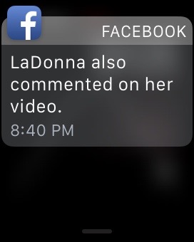
A Facebook notification.

A notification from Amazon.
Example – Notifications
Sadly, I noticed an obituary in my Facebook feed (on my Mac) for someone I used to know years ago. I forwarded it via Facebook messaging to two of my friends who knew him much better than I did, to see if they had heard the news. Then I went into the kitchen to make breakfast.
Very soon, I saw that one of them had replied — her words, “so sad!!,” popped up on my wrist with a tap and a quiet ding. There was something about the immediacy of this that mattered to me — at that point I really appreciated having the watch on my wrist (my iPhone was on my desk in the other room).
It’s not about individual apps, it’s about apps as services. (notifications are the interface)
Right before the watch came out, I came across a few articles that talked about the end of apps as we know them — in favor of notifications. I can now see why that makes sense.
From the article:
In a world where notifications are full experiences in and of themselves, the screen of app icons makes less and less sense. Apps as destinations makes less and less sense. Why open the Facebook app when you can get the content as a notification and take action — like something, comment on something — right there at the notification or OS level. I really believe screens of apps won’t exist in a few years, other than buried deep in the device UI as a secondary navigation.
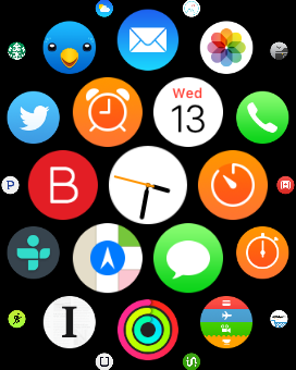
I think this is where it’s going. So when you hear complaints about how it’s difficult to tap those tiny app icons on the watch — the thing is — you hardly ever need to tap them! Most of my interaction is with notifications and glances.
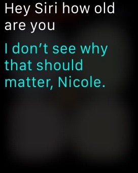
If you do need a specific app opened (and it’s not one of your 12 glances), the best tip I read somewhere is to just talk to the watch: “Hey Siri, open TripCase.” Siri seems to work quite well on the watch. If it doesn’t hear you, just press the digital crown and then it will be listening. But usually it hears me when I say, “hey Siri.”
Talking instead of typing
Talking to my watch:
“Hey Siri, set timer for 15 minutes.” (starts counting down immediately – for steaming some tamales & veggies on my stove)
“Hey Siri, set timer for 45 minutes.” (for the dryer in the basement of my apartment building – gentle dings and taps on my wrist tells me when the alarm goes off – I can tap to dismiss the alarm)
“Hey Siri, what’s the weather today?” (opens Weather app, shows hourly weather)
“Hey Siri, what’s my next appointment?” (opens Calendar app, shows list of upcoming events)
“Hey Siri, open Pandora” (opens Pandora on my iPhone and lets me select which station to start playing)
These are just a few examples where I don’t have to touch the screen at all (except to select a Pandora station). Just talk to my watch, see the result, then lower my wrist (which puts the display to sleep). It works quite well!
Accessibility features
I’m starting to think about what haptic interfaces mean for people with visual and hearing impairments. It’s intriguing! In the meantime, see these posts:
- Apple Watch and Accessibility: First Look, by Steven Aquino.
- My Apple Watch After 5 Days, by Molly Watt, an advocate for those living with Usher Syndrome.
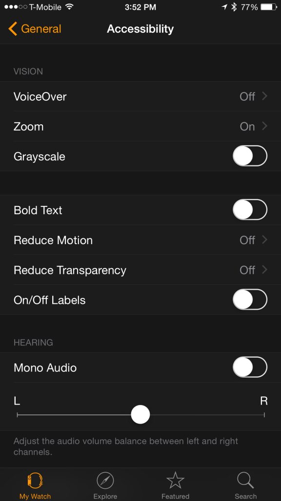
Find these settings under General/Accessibility in the iPhone Apple Watch app.
Coming in part 2 — which apps I like best on the watch
In part two, I’ll discuss which apps I’m using on my watch and which I’m not using yet, because they don’t quite make sense on the watch.
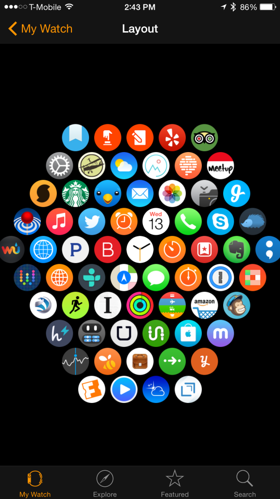
A view of my watch apps from the iPhone app. You can move them around on this screen on your iPhone — much easier than moving them on the Watch itself.
Did you like this article? Get more like this and stay current with mobile apps for education — sign up for Mobile Apps News.


What is the sound like when you play your Pandora app? Can you turn it softer and louder?
Yes, you can adjust the volume, play or pause, thumbs up or down, skip to next track. You can also create a new station by dictating to your watch.
Hey Nic. Is the watch Bluetooth enabled so you can play music to a Bluetooth speaker?
Yes. You can store up to 2GB of music on the watch by syncing a playlist from iTunes. Then you can pair via Bluetooth — and most people pair to headphones. This article shows how: http://www.macrumors.com/how-to/pair-bluetooth-headphones-apple-watch/.